
Behind the Scenes of a Gallery Promo | Fiber Art + the Running Corgi Pendant
- Alex Reynolds

- 2 days ago
- 8 min read
How do you create a promotional photo for an art exhibition?
You start with the story, the materials, and a willingness to experiment until the right image reveals itself.
For this upcoming exhibition, I set out to create a promotional photo that brought together my jewelry and Hannah’s fiber art in a way that felt intentional, textured, and true to the spirit of the show. That meant pulling back the curtain on the creative process: choosing the right pieces, building a backdrop with character, testing compositions, and discovering which image actually told the story best.
Table of Contents
Why I created this gallery promo photo shoot
If you have ever wondered what goes on behind the scenes getting ready for an art exhibition, this is part of that story.
I was taking photos for the promotion of an upcoming summer art event where I am co-arting in the Cornerstone Art Gallery at the Masonic Event Center with Hannah and her fiber arts. The goal was to create at least one strong promotional image we could use on the event page, in social media posts, and anywhere else we needed to help tell people about the exhibition and the work we are doing.
That may sound simple enough. Put the work down. Take the photo. Done.
But that is never really how it works.
A good promotional image has to do more than document an object. It has to carry mood, texture, point of view, and some hint of the story behind the work. It has to feel like the show before people ever step into the room.
That is what I was after here.
What this upcoming exhibition is all about
My name is Alex Reynolds, and I am the founder and designer of Charming Quail™ Jewelry. What we do is make jewelry that helps you revel in whatever it is you nerd out about, but with an elegance that makes everybody else jealous no matter where you go.
That same energy shaped this shoot.
This was not about creating just any product photo. It was about creating a promotional image for an upcoming exhibition that brings my jewelry into conversation with Hannah’s fiber art. I wanted the photo to reflect both the craftsmanship of the individual pieces and the creative relationship between them when they share the same visual space.
That is part of what made this setup so interesting. This was not just about showing jewelry. It was about creating an image that could represent the exhibit itself.
The materials and backdrop I used for the shoot
One of the key elements in this photo shoot was a large piece of slate.
This slate is actually one of the spare pieces left over from redoing the fireplace in my room when we moved in. When we first got the house, the fireplace had some bland, generic tile around it. Replacing that with slate gave it more character and more life, and I had a feeling it could bring that same sense of character into my photography.
I was excited to use it here because it gave the image a grounded, textured base without feeling too polished or sterile. It brought story into the frame before the jewelry even entered it.
Honestly, you will probably start seeing this slate more often in future jewelry photography, because I think it does exactly what I hoped it would do.
It adds life.
The jewelry pieces I brought into the frame
For this shoot, I started with three pieces from my collection:
the honeybee ring
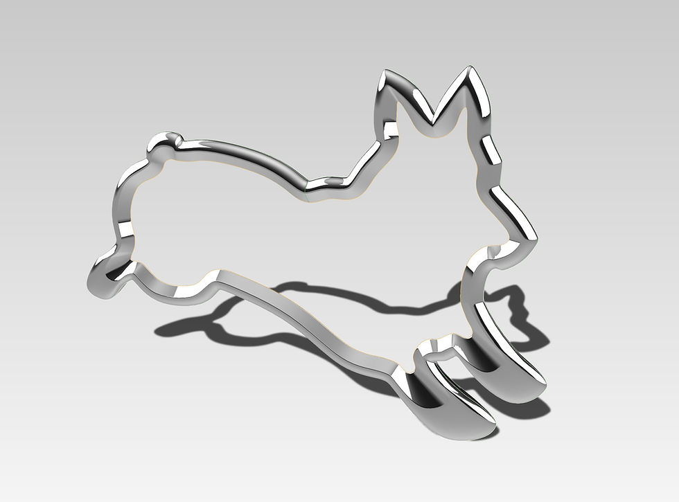
the Running Corgi pendant
the Rebel Princess pendant
Each one brought something a little different to the setup.
The honeybee ring felt connected to the natural materials and themes running through Hannah’s work. It had that back-to-nature quality that made sense in the context of the fiber art.
The Rebel Princess pendant was there partly because I wanted to show it off. At the time of the video, I had not taken photos of that piece yet, and this felt like a good opportunity to experiment.
The Rebel collection itself is based on the idea of rebelling against the diamond industry. It has an almost punk attitude, but the look still lands in a very classical modern style. The design is inspired by the shape of a princess cut stone, and I also love the idea of rebel princesses, so the name Rebel Princess really fit.
But as the shoot unfolded, one piece emerged as the clearest visual and narrative fit.
The story behind Hannah’s fiber art
One of my favorite parts of this whole collaboration is the story behind Hannah’s fiber art.
She started making fiber art because she has a pet cat, and like a lot of people with pets, she bought toys for it. But those toys were made out of plastics and synthetics, and over time her cat would tear them up and start consuming bits of those materials. That raised a concern for her, so she started looking for natural alternatives she would feel better about her cat playing with.
She looked and looked and could not find what she wanted.
So she made it herself.
That is how it started. She wanted to create cat toys made out of natural materials that she felt comfortable with her cats playing with. I think that is a pretty cool story, and it adds even more meaning to the textures and materials in her work.
There was another thing that struck me during the shoot. When we first talked about doing this, I told her to just give me something she already had that might work well with small jewelry.
She said she would just make something.
I told her not to go out of her way.
Less than a week later, she was at my door with a piece ready.
That still amazes me.
And seeing it up close made me appreciate it even more. The closer I looked, the more I noticed the detail in the fibers and strings. It had this texture that made the photography richer and more interesting. I also got the feeling she was genuinely excited to create something that could hold or display jewelry, and that made the collaboration feel even more intentional.
Why the Running Corgi pendant became the featured piece
Even though I began the shoot with multiple jewelry pieces in mind, the Running Corgi pendant quickly became the natural focal point.
The reason came back to Hannah’s story.
If her fiber art began with a desire to create better, more natural options for pets, then the corgi piece felt like the strongest connection. I do not have cat jewelry at this time, but I do have a corgi collection, and the Running Corgi pendant felt like the best bridge between our two worlds.
Dogs have the same issue, after all. So many pet toys are made from plastics and synthetics that we do not really want animals consuming. That made the Running Corgi pendant feel especially right in this setup.
The honeybee ring still made sense thematically, and the Rebel Princess pendant was still a strong visual piece, but the corgi had the clearest storytelling role in the final promotional image.
How the promotional image evolved during the shoot
Like a lot of creative work, this photo shoot changed once I got my hands on the materials and started moving pieces around.
I started with one jewelry piece, but quickly realized that the larger fiber art really wanted more than one piece on it. It actually holds multiple jewelry pieces very well, and there was something compelling about seeing several pieces sitting together in that textured space.
So I tried a wider composition.

Then I looked at it and felt like it was a little unfocused.
That is when I started moving in closer.

I shifted from showing the whole fiber art piece to cropping out some of the jewelry and some of the fiber art, experimenting to see what happened when the frame became more selective. Then I cropped in again, getting closer still, until the composition centered on a single jewelry piece in the corner of the fiber art.
That is where the image came alive.
The tighter crop did a better job of showing off the fibers Hannah used, and it gave the pendant room to stand out without losing the collaborative feel of the image. Instead of trying to show everything, it let the right details speak.

The final image we chose for the exhibition promo
The final image was a close-up of the Running Corgi pendant sitting in the corner of Hannah’s fiber art.
That was Hannah’s favorite photo, and it became the one we chose for the promotional image.
I love the balance in it.
It shows off the detail and craftsmanship of the fiber art while still keeping the jewelry as the focal point. It lets both pieces of work remain visible and important without either one overwhelming the other. That made it feel right not just as a photo, but as a representation of the exhibition itself.
That final photo is the one we are using as the promotional image for the upcoming show.
Why I share behind-the-scenes art videos like this
I do these photo videos from time to time because when I make pieces, I have to photograph them anyway. And if I am already doing the work, why not pull back the curtain and invite people in to see how it all comes together?
I think there is something valuable in letting people see the process.
Not just the polished final image, but the decisions behind it. The materials. The stories. The trial and error. The moment when a composition does not quite work yet, and the moment when it finally does.
That is part of the art too.
Learn more about the exhibition
Learn more about our upcoming exhibition at Cornerstone Gallery here: https://www.charmingquail.com/event-details-registration/upcoming-exhibition-at-cornerstone-gallery.
On the event page, you can RSVP to receive event reminders, updates, and notice of any changes as the exhibition gets closer, and you can also use the links there to connect with fiber artist Hannah and Cornerstone Art Gallery.
FAQ
What is this blog post about?
This blog post shares the behind-the-scenes creative process of producing a promotional photo for an upcoming summer exhibition featuring Charming Quail™ jewelry and Hannah’s fiber art.
Who is Alex Reynolds?
Alex Reynolds is the founder and designer of Charming Quail™.
What is Charming Quail™?
Charming Quail™ creates jewelry that helps people revel in whatever they nerd out about, with elegance and style.
What exhibition is this photo shoot for?
The photo shoot was created to promote an upcoming summer exhibition at Cornerstone Art Gallery at the Masonic Event Center with Hannah and her fiber arts.
What jewelry pieces were included in the shoot?
The shoot included the honeybee ring, the Running Corgi pendant, the Rebel Princess pendant, the Rebel Princess ring, as well as other pieces from the Royal Corgi Collection.
Why was the Running Corgi pendant featured in the final promotional image?
The Running Corgi pendant connected especially well to Hannah’s story about creating fiber art inspired by the need for better, more natural pet toys.
What is the story behind Hannah’s fiber art?
Hannah began making fiber art because she wanted natural alternatives to plastic and synthetic toys for her cat.
What was used as the backdrop for the shoot?
A large piece of slate left over from a fireplace remodel in the family room was used as part of the backdrop.
How did the final image come together?
The final image emerged through experimentation. The shoot began with wider compositions and multiple jewelry pieces, then evolved into a tighter crop focused on the Running Corgi pendant in the corner of Hannah’s fiber art.
Why does this blog post include a video?
The embedded video gives readers a fuller behind-the-scenes look at the process of creating the promotional image and preparing for the exhibition.


Comments